
Why Three Personal Color Analyses Can Give Three Results
Three personal color results can differ because studios use different palette systems, viewing conditions and judgment thresholds. Compare temperature, value and intensity before choosing a label.
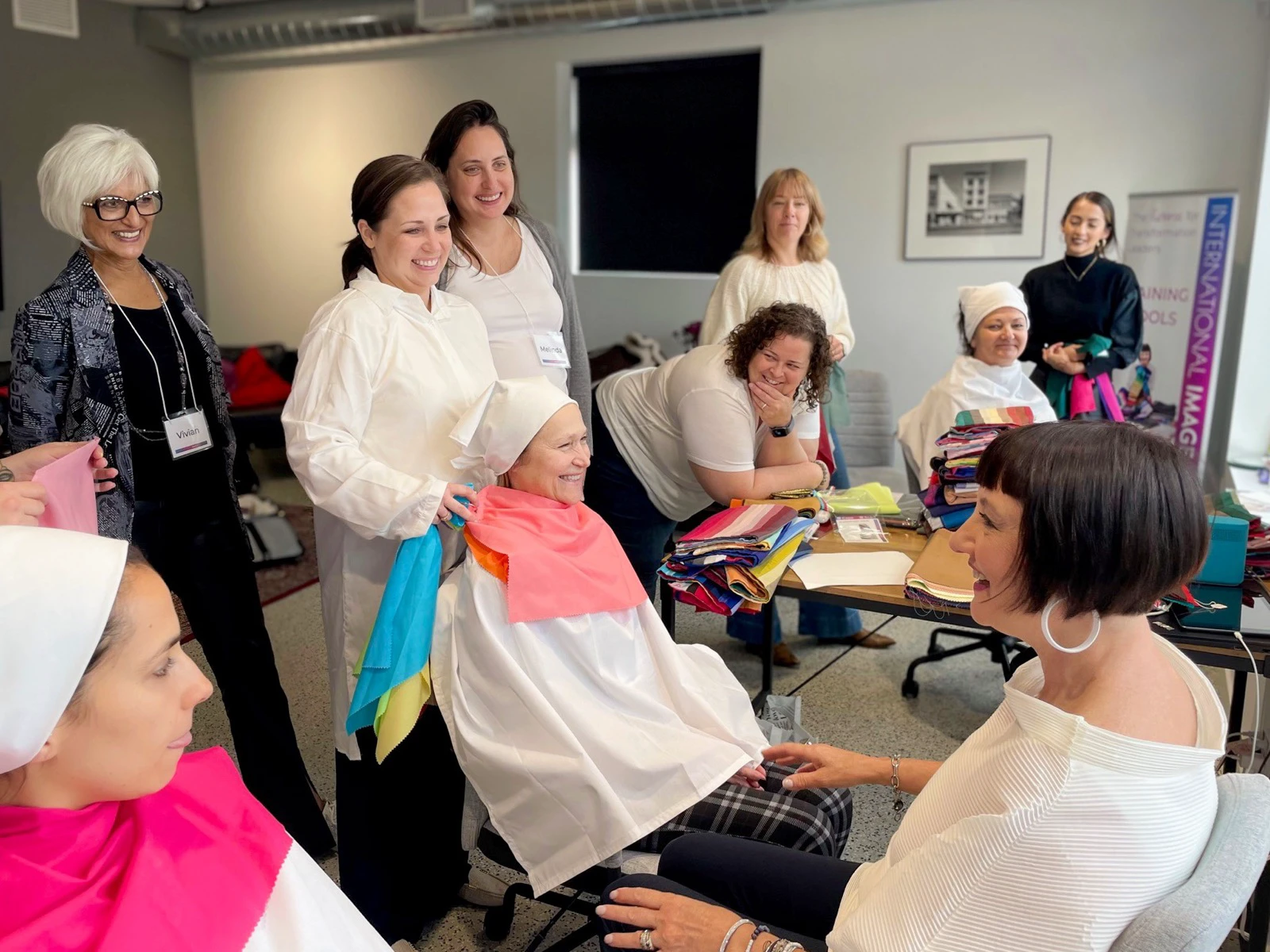
Yes. Three personal color appointments can return three labels without your coloring having changed. The result depends on the palette system, the viewing conditions, and the analyst’s threshold for calling a drape better or worse. Treat the season name as a styling conclusion, not a universal physical measurement.
The quickest way to reconcile the reports is to translate each label into three questions: Do the recommended colors run warmer or cooler? Lighter or deeper? Clearer or softer? Two studios may disagree on “Spring” versus “Summer” yet agree that lightness matters most.
Systems and supporting sources were rechecked on August 11, 2026.
1. First check whether the studios used the same grid
Some systems stop at four seasons; others split them into narrower groups. The International Image Institute’s current system offers 10, 16 and 23 palettes. Its 10-palette version adds Cool, Warm, Deep, Light, Bright and Muted to the four seasons; the 16-palette version adds seasonal subgroups; the 23-palette version includes all of those plus a Universal palette for true-neutral coloring.
That means Summer, Light Summer and Cool and Light can be different names for overlapping advice. Even Light Spring and Light Summer agree on value while disagreeing on temperature. Before comparing two labels, ask each studio which system and how many palettes it used.
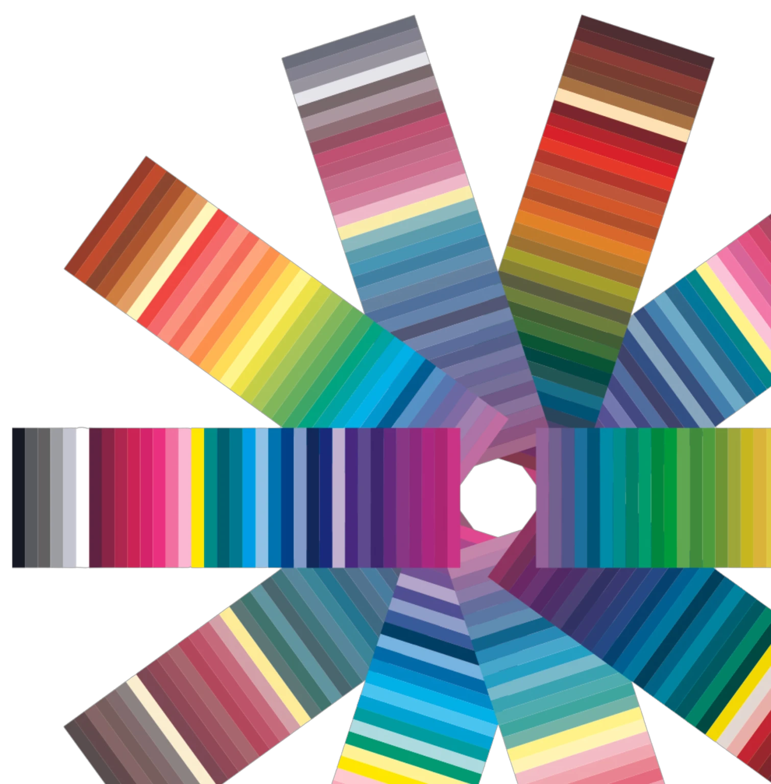
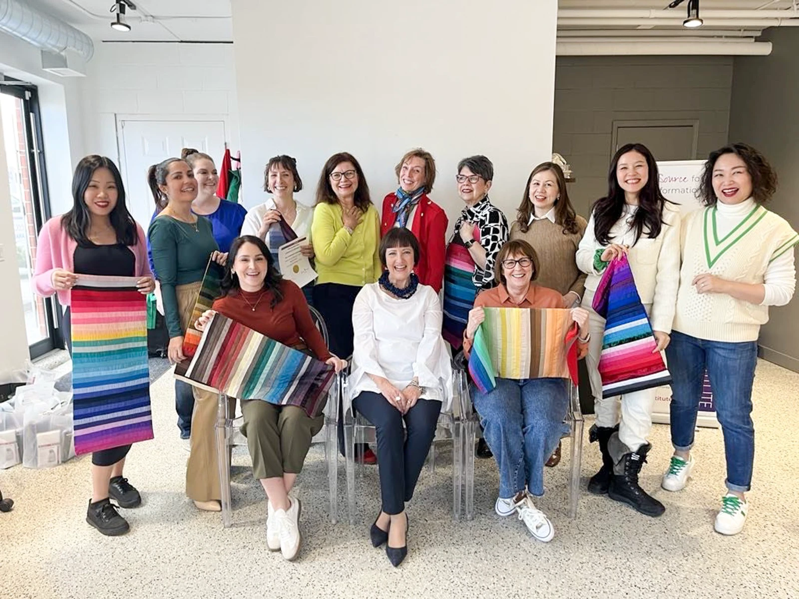
The distinction is not merely vocabulary. A broad grid forces borderline coloring into a larger box; a finer grid can name the border. Neither label is useful unless the analyst can show which neighboring drapes created the decision.
2. Lighting is part of the evidence
Fabric color reaches the eye through reflected light. A warm lamp, cool daylight, a colored wall or uneven shadow can change how skin and cloth compare. ISO 105-J05:2007, reconfirmed as current in 2022, provides a method for estimating how a textile’s perceived shade changes when the illuminant’s chromaticity changes. It is a textile test, not a validation of seasonal personal color, but it supports the practical point that the same cloth need not look identical under different light.
X-Rite’s visual-evaluation guide likewise explains why color temperature alone does not fully describe a light source and why controlled viewing conditions matter.
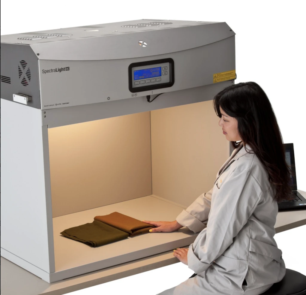
The booth above is for industrial color evaluation, not a beauty appointment. A Seoul studio does not need this machine. It does need even, neutral-looking light and a setup that lets the analyst switch neighboring drapes without a strong color cast.
A 2026 clinical imaging study indexed by PubMed found that device differences remained a barrier in skin-tone evaluation and that ColorChecker calibration under standardized lighting reduced those differences. That study concerns medical full-face photographs, not personal color seasons. Its limited relevance here is to show why an online result can be more sensitive to camera, screen and lighting than an in-person draping.
3. In-person and photo-based results are not equivalent
The Institute’s current colour-analysis training page teaches undertone, value and intensity, and describes a structured draping process. Its FAQ recommends substantial in-person experience before offering virtual analysis because virtual work requires greater skill.
For an online appointment, ask how the studio controls daylight, white balance, exposure, phone filters and screen calibration. A selfie taken beside a yellow wall is not the same evidence as drapes changed under one stable setup. If three results include both online and in-person sessions, compare the in-person drape sequence first—but still require an explanation rather than assuming the room-based label must be correct.
Makeup, freshly dyed hair, a tan, temporary redness and bright clothing near the face can also shift what the analyst sees. These factors matter most when you sit near a boundary; they do not mean your underlying coloring changes every week.
4. Draping still includes human judgment
Analysts may watch for under-eye shadow, redness, facial definition, contrast, or whether the fabric becomes more noticeable than the face. One may favor the clearer effect of a bright drape; another may reject it because the cloth appears before the person.
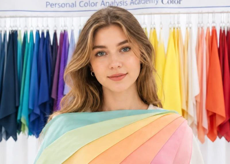
A useful appointment makes that judgment visible. You should see adjacent drapes change, hear what feature is being evaluated and learn which dimension is decisive. A device reading can add information, but it does not automatically settle a wardrobe or makeup choice.
5. Read re-analysis stories for clues, not proof
In one Naver Blog re-analysis account, the writer moved between Spring Light and Summer Light while lightness stayed consistent. In a Reddit report about three online results, labels ranged from Soft Autumn to Light Spring and Soft Summer; discussion repeatedly returned to the limits of judging undertone and chroma from images.
A separate Reddit comparison of Western and Korean analyses described apparently opposite labels while the clothing, makeup and lightness recommendations did not fit neatly into one season. These are individual experiences, not accuracy studies. Their value is showing where to look for the stable clue hidden beneath a changing label.
6. Compare three reports without taking a vote
Make one row for each appointment and rewrite its result on three axes:
- Temperature: warm, cool or near neutral
- Value: light, medium or deep
- Intensity: clear/bright or soft/muted
Then list the actual best and difficult drapes. If two reports favor light, low-contrast colors but use different season names, combine the advice. If one favors clear cobalt while another favors dusty beige, the conflict is real: compare the lighting, drape pair and explanation instead of letting the newest result win by default.
When booking a re-analysis, bring the old palettes and ask:
- Which system and how many palettes are you using?
- Which dimension is strongest, and which is borderline?
- Which two drapes decided the result, and what changed in my face?
- Does the advice apply equally to clothing and makeup?
- Which colors can I borrow from the neighboring group?
The best outcome may be a range—such as light, neutral-cool and moderately soft—rather than one perfectly tidy season. Keep the repeatable observations, test them with clothes you actually wear and use the label only as a shortcut.
Sources and image credits
- International Image Institute — Colour Analysis System — Current descriptions of the 10-, 16- and 23-palette systems; rechecked August 11, 2026.
- ISO 105-J05:2007 — Current textile method concerning perceived shade changes under illuminants with different chromaticity; used with the stated scope limitation.
- X-Rite — The Science Behind Visual Evaluation — Controlled-viewing and light-source context; also the original source of the booth image.
- PubMed — Enhancing reliability of skin tone evaluation — 2026 clinical imaging study on device variation and standardized-light calibration; not a study of seasonal analysis.
- International Image Institute — Colour Analysis course — Current training outcomes, structured draping and virtual-analysis qualification context; original source of the training images.
- Naver Blog re-analysis account — Attributed individual experience; not used as an accuracy study.
- Reddit — three online results — Attributed community experience about differing labels.
- Reddit — Western and Korean analyses — Attributed individual comparison; not a policy or accuracy study.
- Visit Seoul — Color Signal — Original source of the Seoul consultation image.
- Delivery Spot cover image file — Existing cover showing a supervised colour-analysis training session.
- Delivery Spot palette-fan image file — Existing uploaded image credited to the International Image Institute.
- Delivery Spot training image file — Existing uploaded image credited to the International Image Institute.
- Delivery Spot light-booth image file — Existing uploaded image credited to X-Rite.
- Delivery Spot Seoul consultation image file — Existing uploaded image credited to the Seoul Tourism Organization / Visit Seoul.
Last updated


