
How Vertical-Scroll Webtoons Changed the Way the World Reads Comics
Vertical-scroll webtoons did more than move comics onto phones. They turned blank space, the moving screen, and the reader's thumb into tools for timing, suspense, scale, and emotion. Here is how a Korean web format became a global comics language—and what it gains and loses compared with a printed page.
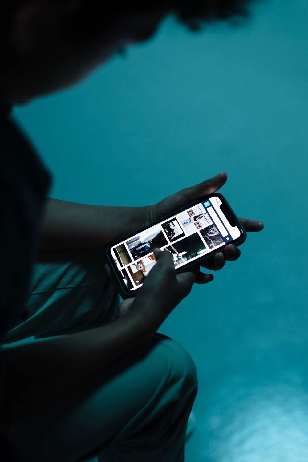
A webtoon is not simply a printed comic cut into phone-sized pieces. In its strongest form, the vertical scroll is part of the storytelling: the screen hides what comes next, blank space delays a response, and the reader's thumb decides when a reveal arrives. The format changed not only where people read comics, but how artists compose time, space, suspense, and scale.
That distinction matters because the familiar origin story is often told backward. Smartphones did not invent Korean vertical webtoons. Artists were experimenting with continuous downward layouts on desktop screens first; the phone later made that visual language feel natural around the world.
The scroll came before the smartphone boom
Comics scholar Heekyoung Cho traces early Korean webcomics from page-like and horizontal layouts toward the vertical form. In her history of webtoon as a new graphic narrative, she identifies Sim Seunghyeon's Pape and Popo's Memories in 2002 as an early vertical Korean webcomic and Kang Full's A Romance Comic on Daum in 2003 as the breakthrough that helped the format spread. Readers were scrolling with a mouse before they were swiping with a thumb.
The smartphone nevertheless completed the match. A tall comic fits a tall screen; one hand can advance the story without zooming around a dense page. A 2025 overview from KDI's Economic Education and Information Center describes the 2010s mobile-first period as the moment when touch screens made the already-developing vertical format ideal for self-paced, one-handed reading. What began as a Korean web-native experiment became a portable habit.
The screen became a moving window
A printed page presents a field. Even when you read in the intended order, your peripheral vision can glimpse a large panel, a surprise face, or the shape of the page ahead. A vertical webtoon presents a moving window. Only a portion of the episode is visible, and the unseen area below the screen can hold back information.
That changes the balance of control. The artist determines the sequence and spacing, but the reader supplies the motion. A small swipe can expose a reaction; a longer drag can uncover a body, a building, or a creature in stages. The experience sits between turning a page and watching an edited shot: it is directed, but not automatic.
Cho gives a vivid example from Yun Tae-ho's A Country Pumpkin. A very long panel follows divers from the water's surface toward a dark seabed. Readers cannot see the whole descent at once. Repeated scrolling makes them spend physical and reading time moving through darker water before the wreck appears. Depth, duration, and uncertainty become the same gesture. That effect would have to be divided across several printed pages or compressed into a much smaller image.
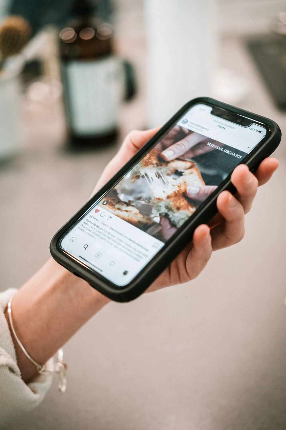


These three reading situations show why the format traveled so well: a portrait screen holds the sequence, one hand can keep the story moving, and the thumb becomes a simple editing control. The images show ordinary phone use rather than copyrighted webtoon panels.
Empty space stopped being empty
In print, the gutter is usually the narrow boundary between panels. In a vertical webtoon, the gap can be taller than the screen. It can represent a pause before an answer, the emotional distance between two characters, a jump in time, or the silence after a shock. A colored or textured background can also flow across several panels and hold a mood together.
This is one of the format's most important innovations: space becomes duration. A short gap keeps dialogue brisk. A long gap makes the thumb travel, so the reader feels a beat rather than merely recognizing one. A sudden panel after a stretch of darkness can work like a cut. Closely stacked reaction shots can accelerate an argument; generous spacing can make the same exchange hesitant or lonely.
The effect is not a fixed formula. A long blank area is not automatically dramatic, and repeated giant gaps can become padding. The craft lies in relating distance to the moment: how long the reader should wait, what remains visible at the top of the screen, and what the next swipe will reveal.
Downward motion created new kinds of spectacle
The reading direction gives vertical webtoons a natural visual force. Falls, dives, elevator shafts, rain, towers, transformations, and descending attacks can continue beyond one screen. An artist can connect several moments into one uninterrupted composition, letting the reader travel through it instead of viewing it at postcard size.
The same principle works quietly. A conversation can stack faces and gestures like beats in a performance. A character entering a room can be revealed from shoes to expression. A city panorama can open gradually, preserving scale on a small device. Horror and suspense benefit especially because the frightening information can remain literally below the fold. Cho compares a web and print version of Kang Full's A Neighbor: the open print spread risks exposing the source of a woman's fear, while the scroll can withhold it until the reader moves down.
Readers notice this when artists use the format as more than a panel conveyor belt. In a Reddit discussion seeking creatively composed vertical comics, commenters highlighted long transitions, shadows running down the page, water, and fight scenes that felt like a continuous camera move. Those are subjective recommendations, not critical consensus, but they reveal what the audience is responding to: choreography made for a moving viewport.
Episodes changed around the phone, too
The scroll affected more than individual panels. A digital episode can end at a carefully chosen downward reveal rather than at the physical limit of a page count. Weekly serialization encourages strong opening reminders, mid-episode turns, and cliffhangers that make the next update feel urgent. Full color and screen light became normal parts of the look. Sound and limited animation can be added by some platforms, although neither defines a webtoon.
Production adapted as well. Creators work on long digital canvases and then divide files to meet platform upload limits. Assistants or studio teams may handle backgrounds, color, lettering, or effects under tight serialization schedules. The format also lowered a distribution barrier: a creator did not need to print and ship a book before reaching international readers. Platforms could translate, localize, recommend, and serialize the same downward-reading work across markets.
That global spread does not mean every vertically read comic is Korean, or that every Korean comic uses the form in the same way. It means a format developed through Korea's portal and webtoon ecosystem became a shared creative language. Artists in many countries now compose directly for the phone rather than merely adapting pages after publication.
What the scroll gives up
The format is powerful because it restricts the view, and that restriction has costs. A printed page lets artists build relationships across a complete layout, use a double-page spread, place simultaneous events side by side, or invite the eye to wander and return. The reader can see the architecture of the page as a whole. Vertical episodes favor sequence and reveal, but they can weaken that overview.
They are also awkward to reverse-engineer for print. Panels designed around long gaps may produce excessive pages, while a spectacular tall composition may need to be cut, reduced, or rebuilt. Starting with print pages and converting them to scroll can be equally difficult: text becomes tiny on a phone, and dismantling a carefully balanced page may destroy its rhythm.
Creators debate that trade-off openly. In a Reddit thread about whether to switch from pages to scroll, one artist worried that conversion would erase cohesive page composition, while readers and other creators emphasized phone legibility and the scroll's control of pauses and tension. It is an anecdotal community discussion, but the dilemma is real. The best primary format depends on where the work will be read and which kind of composition the artist values most.
How to see the craft on your next read
Try reading one episode more deliberately. Before each swipe, notice what the screen allows you to see and what it hides. Watch for four choices:
- Gap length: Does the empty distance feel like a breath, a time jump, or suspense?
- Reveal position: Does a face, threat, or landscape enter a little at a time?
- Continuous movement: Does one background or action extend through several screens?
- Episode rhythm: Where does the update accelerate, pause, and place its final hook?
Then imagine the same sequence on an open book. Some scenes would become clearer as a page; others would lose their timing, height, or surprise. That comparison explains why vertical webtoons are not a lesser copy of print comics. They are a related form with a different unit of composition: not the page, but the changing screen.
The deepest innovation is simple. A comic once asked the reader to turn a sheet. The webtoon asks the reader to move a window—and makes that movement part of the story.
Photo credits
- Featured photo: Ron Lach on Pexels.
- Social-feed close-up: Connor Scott McManus on Pexels.
- One-handed reader: Hayan on Pexels.
- Thumb-scroll photo: Tirachard Kumtanom on Pexels.
Sources and image credits
- her history of webtoon as a new graphic narrative — Checked for guide details or image attribution.
- 2025 overview from KDI's Economic Education and Information Center — Checked for guide details or image attribution.
- Reddit discussion seeking creatively composed vertical comics — Checked for guide details or image attribution.
- Reddit thread about whether to switch from pages to scroll — Checked for guide details or image attribution.
- Ron Lach on Pexels — Checked for guide details or image attribution.
- Connor Scott McManus on Pexels — Checked for guide details or image attribution.
- Hayan on Pexels — Checked for guide details or image attribution.
- Tirachard Kumtanom on Pexels — Checked for guide details or image attribution.
Last updated


